前言
不知道大家有沒有經驗是要「在網頁裡將資料圖表化」的經驗
在這之前我真的是一竅不給通,想說是不是非常困難的東西。
但 Python 有個 package 叫 “plotly“,
就像magic一樣不廢吹灰之力就將資料從 「數字」–> 「圖plot」
雖然在網站中畫圖的方法百百種,但這應該是我目前知道最直接且簡單的寫法了
用Plotly在django中顯示圖表
首先先在終端機內輸入 pip3 install plotly 將plotly的package下載回來:
pip3 install plotly 假設你的Project架構如下:
mysite
├── manage.py
├── template
│   ├── index.html
├── mysite
│   ├── __init__.py
│   ├── settings.py
│   ├── urls.py
│   └── wsgi.py
└── trips
    ├── __init__.py
    ├── admin.py
    ├── migrations
    ├── models.py
    ├── tests.py
    └── views.py
我們先在 trips/views.py import 以下程式碼:
#trips/views.py

from django.shortcuts import render

from plotly.offline import plot
import plotly.graph_objs as go

def index(request):
    x_data = [0,1,2,3]
    y_data = [x**2 for x in x_data]
    plot_div = plot([Scatter(x=x_data, y=y_data,
                        mode='lines', name='test',
                        opacity=0.8, marker_color='green')],
               output_type='div')
    return render(request, "index.html", context={'plot_div': plot_div})
可以看到我是要將這個以plt_div 儲存的 plot 傳到index.html中顯示
如果大家想要更了解plotly 跟Dash是如何運作的
可以參考 Udemy上的這個課程
Interactive Python Dashboards with Plotly and Dash
或是參考我這篇文章 【2020】我的Python學習心路歷程
裡面有談到為什麼我要上這門課
記得,因為你的 html 是在 templates 的資料夾中,所以mysite/settings.py 要設定為:
# mysite/settings.py

TEMPLATES = [
    {
        'BACKEND': 'django.template.backends.django.DjangoTemplates',
        #modify this line to find your templates folder
        'DIRS': [os.path.join(BASE_DIR, 'templates')],
        'APP_DIRS': True,
        'OPTIONS': {
            'context_processors': [
                'django.template.context_processors.debug',
                'django.template.context_processors.request',
                'django.contrib.auth.context_processors.auth',
                'django.contrib.messages.context_processors.messages',
            ],
        },
    },
]
urls.py也不要忘記設定了,不然django會找不到url
#urls.py

from django.contrib import admin
from django.urls import path, re_path
from mysite import views

urlpatterns = [
    re_path(r'^admin/', admin.site.urls),
    re_path(r'^$', views.index, name='index'),
]
在index.html中加入以下程式碼
<!-- index.html -->

<!DOCTYPE html>
<html>
    <head>
        <title>I come from template!!</title>
    </head>
    <body>
        {% autoescape off %}
        {{ plot_div }}
        {% endautoescape %}
    </body>
</html>
結果會顯示像這樣的圖表
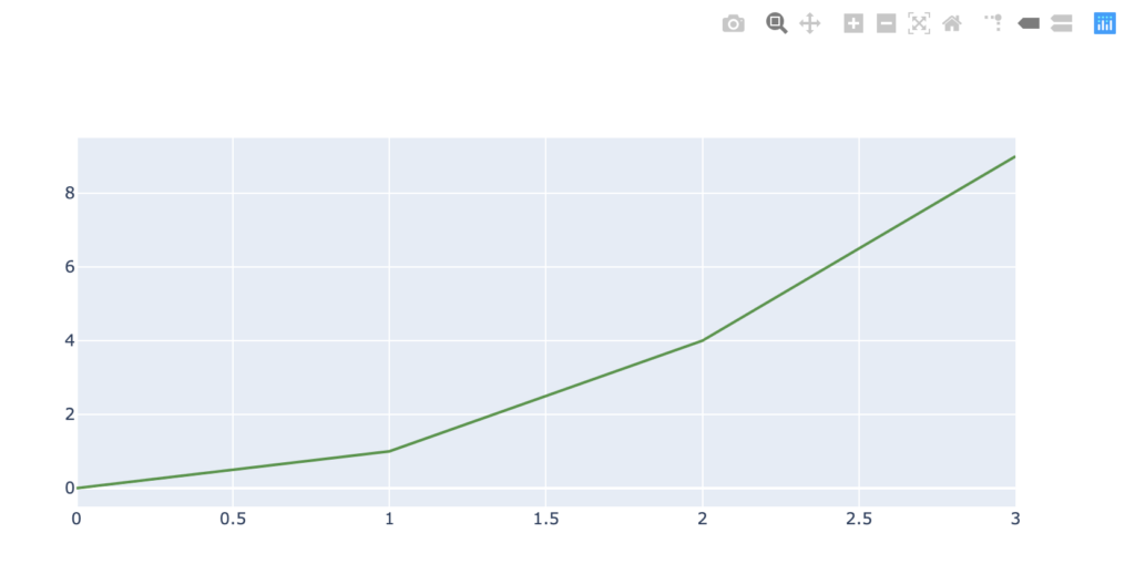
大功告成
結語
看完之後想必大家都知道要如何用plotly在django中畫出圖表了
但真正知道如何處理資料才能畫出有意義的圖表,比如說在x軸的資料應該放什麼,y軸應該放什麼,不同的資料應該用什麼樣的圖表呈現最為恰當。
至少以上明白後才能依靠自己的能力寫出一個有意義的圖表,如果對 panda 的 dataframe 和 numpy 一竅不通的人,「強力建議」一定要有相關基礎的知識,不然看到資料只會是一片茫然。我之前是在 Udemy上 Interactive Python Dashboards with Plotly and Dash,這個課程 幫我累積了 panda, numpy, dataframe, data set 等等的概念,也增加我對「什麼資料該用什麼圖表呈現」的敏感度
如果對文章內容有任何問題,歡迎在底下留言讓我知道。
如果你喜歡我的文章,可以分享我的文章,讓更多的人看見我的文章。
追蹤我的Instagram,看我分享 #愛喝咖啡 #咖啡程式
如果這篇文章對你有幫助,
可以幫我在下方按 5 個Like 讓我得到一些回饋,
支持我繼續寫出更多好文章
- 【2025最新評測】數位學習革命:O’Reilly Learning Platform 完全指南
- 【AI 學習】1-5 使用 Transformer 模型生成文字:運作原理大公開
- 【AI 學習】1-4 Transformer出現前的文字生成:AI語言模型的進化之路
- 【AI 學習】1-3 大型語言模型的廣泛應用與驚人能力:不只是聊天機器人
- 【AI 學習】1-2 生成式AI與大型語言模型入門:人人皆可懂的解析
- 【AI 學習】1-1 深入淺出:Transformer模型與生成式AI專案生命週期
- 【SSH】製作SSH key教學
- 【快速架站】什麼是Hexo? 5分鐘快速架站教學
- 【Python】Quick Sort 快速排序|演算法介紹、新手快速入門
- 【Python】Insertion Sort 插入排序|演算法介紹、新手快速入門
在〈【Django】用Plotly在django中顯示圖表〉中有 1 則留言